Category: process

AWA-AWA

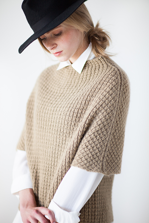
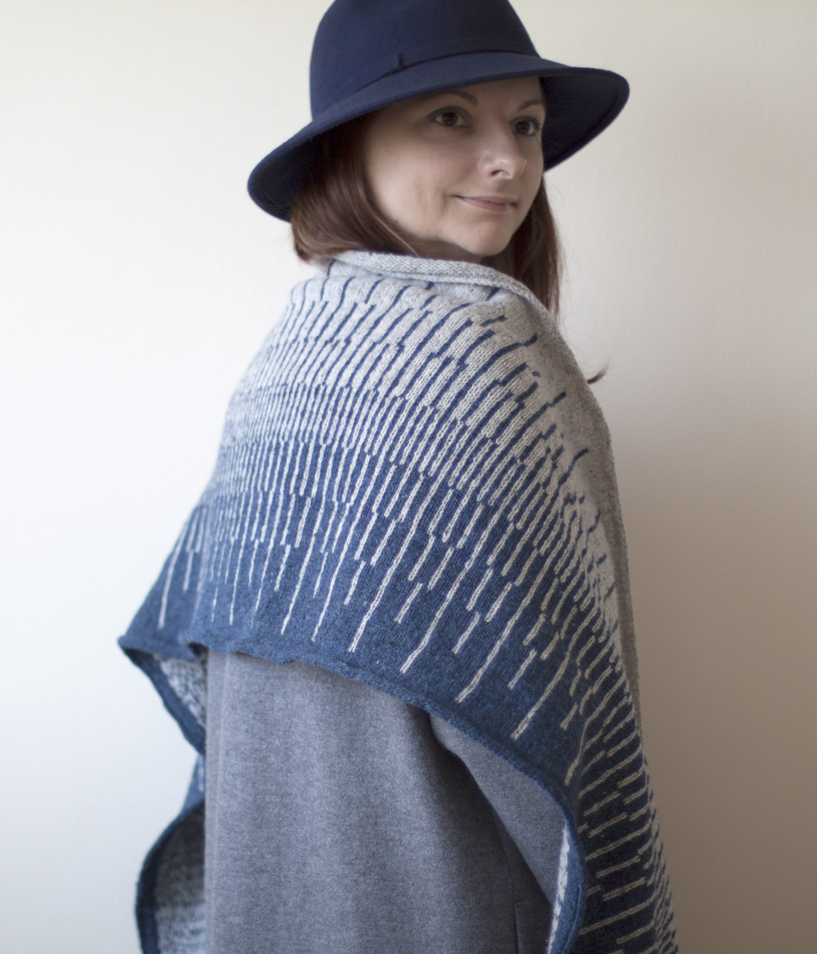
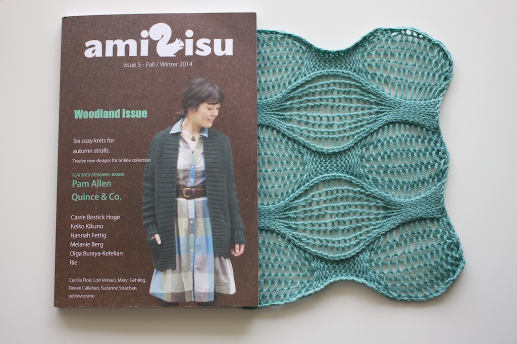
Awa-Awa is another onomatopoeic word that means “soap bubbles” in Japanese..

I must admit, ever since I have gotten my knitting machine back in 2011 in Japan I have discovered a whole new way of looking at hand knitting in absolutely new angle! Machine knitting and hand knitting couldn’t be any different from each other. Complete polar opposites in my mind, but the thinking that machine knitting triggers for a hand knitter is so illuminating and it opens up a well of new techniques and ways to explore that knowledge and implement it if possible into hand knitting! I remember talking to my friend and fellow designer Kirsten Johnstone , who together with her friend Suzie Fry just had taken their machine knitting course and we got into conversation about how various techniques can be achieved. My excitement about my new “toy” often wouldn’t let me sleep. As I explored around in search of any machine knitting courses while in Japan, I was out of luck for not being fluent in Japanese to take them. Machine’s manual, YouTube videos. Numerous swatches later I felt like I was learning a new language. Even though it is still both knitting, they reside in separate universes. Later on thanks to Marianne Isager who introduced me to Mette Hyllested-Winge, Danish machine knitwear designer living in Tokyo at the time, who basically became my machine knitting teacher. She let me ask all the questions and work out all possible ideas I had brewing in my head. I have been so lucky to have met her! Engaged into two different worlds of knitting we often spent hours and hours contemplating and bouncing ideas off of each other, and get inspired by one another! That’s how I have discovered what is called “plating” in machine knitting world, which Awa-Awa’s technique is inspired by.

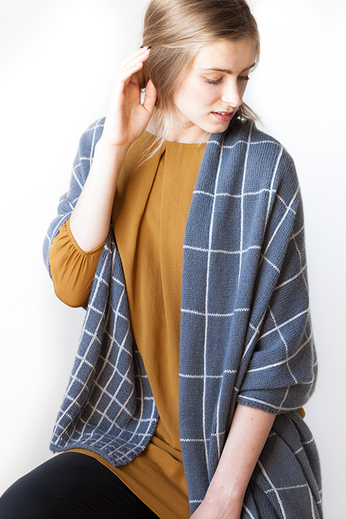
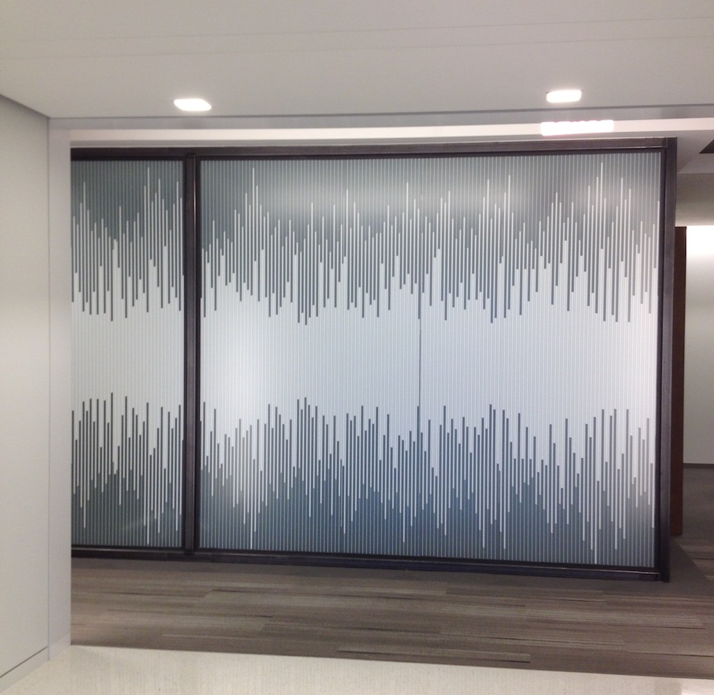
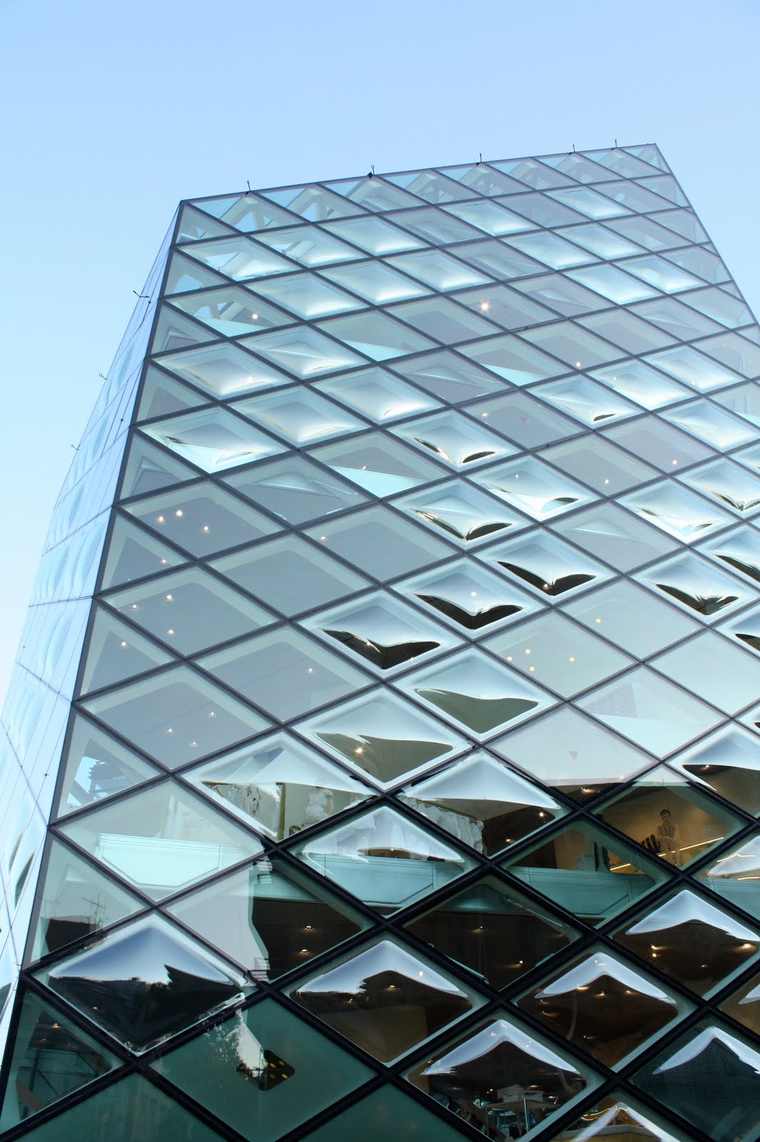
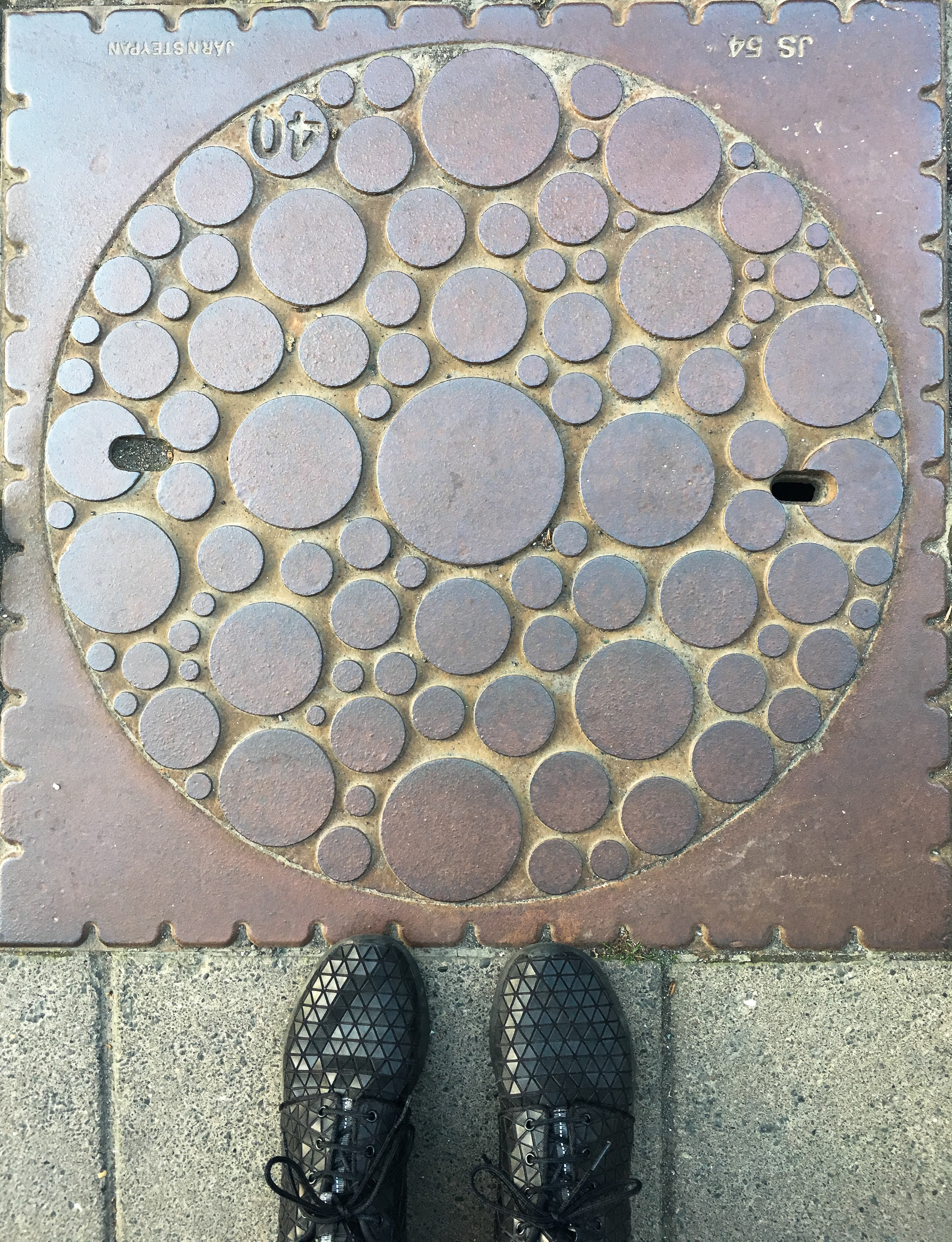
When Carrie (editor of Making magazine) approached me about my submission for DOTS issue , I had way too many ideas. I had some still lingering from my mini-collection with Quince & Co called Circles+Dots and I had just heard about Yayoi Kusama’s exhibit coming to a museum DC with a retrospective show. She is the world known Japanese artist famous for her works reflecting love of polka dots, circles and their infinite use among many others. I was eager to dive into the process and explore, to swatch and discover which marriage of stitches, yarn and color might be the best option to fit the indigo-themed issue. Several attempts and stumbles later resulted in a pile of new swatches and techniques, where Awa-Awa‘s patterning resonated both with Carrie and me. But why is it that I enjoy the process of development so much – I got 3 more solid concepts using circles, that I filed it in my “ideas bank” to knit up later.  For me personally, this is just an example how endless swatching and brainstorming can lead one thing to another, and end up being something that can be knit and hopefully enjoyed when being knit and worn by others as well. And remember, inspiration is all around us, sometimes you just need to look down, like this awesome manhole cover I photographed somewhere in Japan.

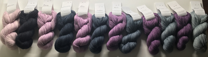
Just as in any knitting with color, picking them can present a challenge, so I have swatched several options for you to consider based on the color values.

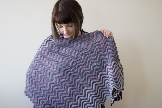
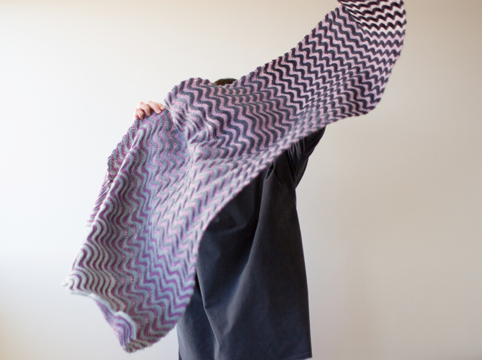
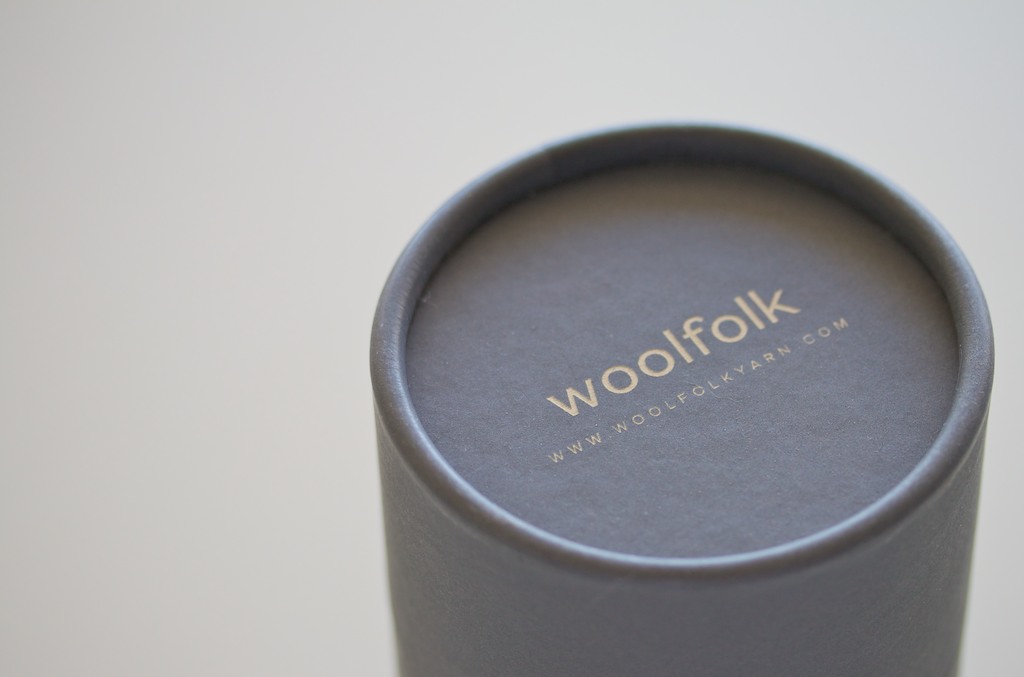
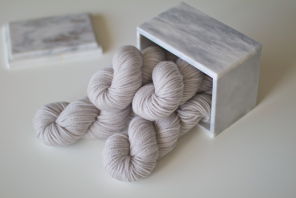
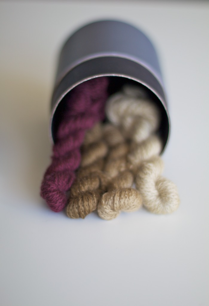
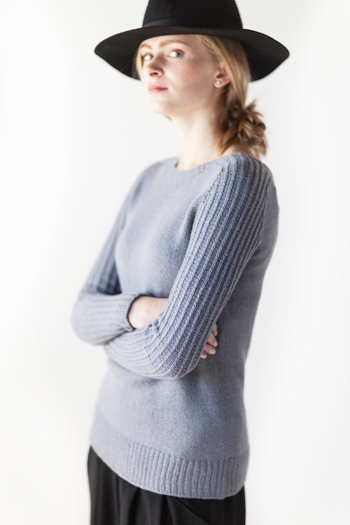
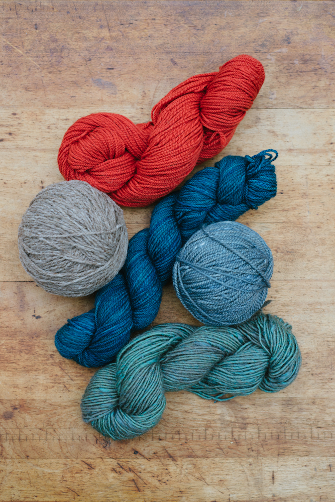
The yarn used, Woolfolk Tynd, comes in an array of colors that you can carry together and pairing them together can produce truly different effect each time.

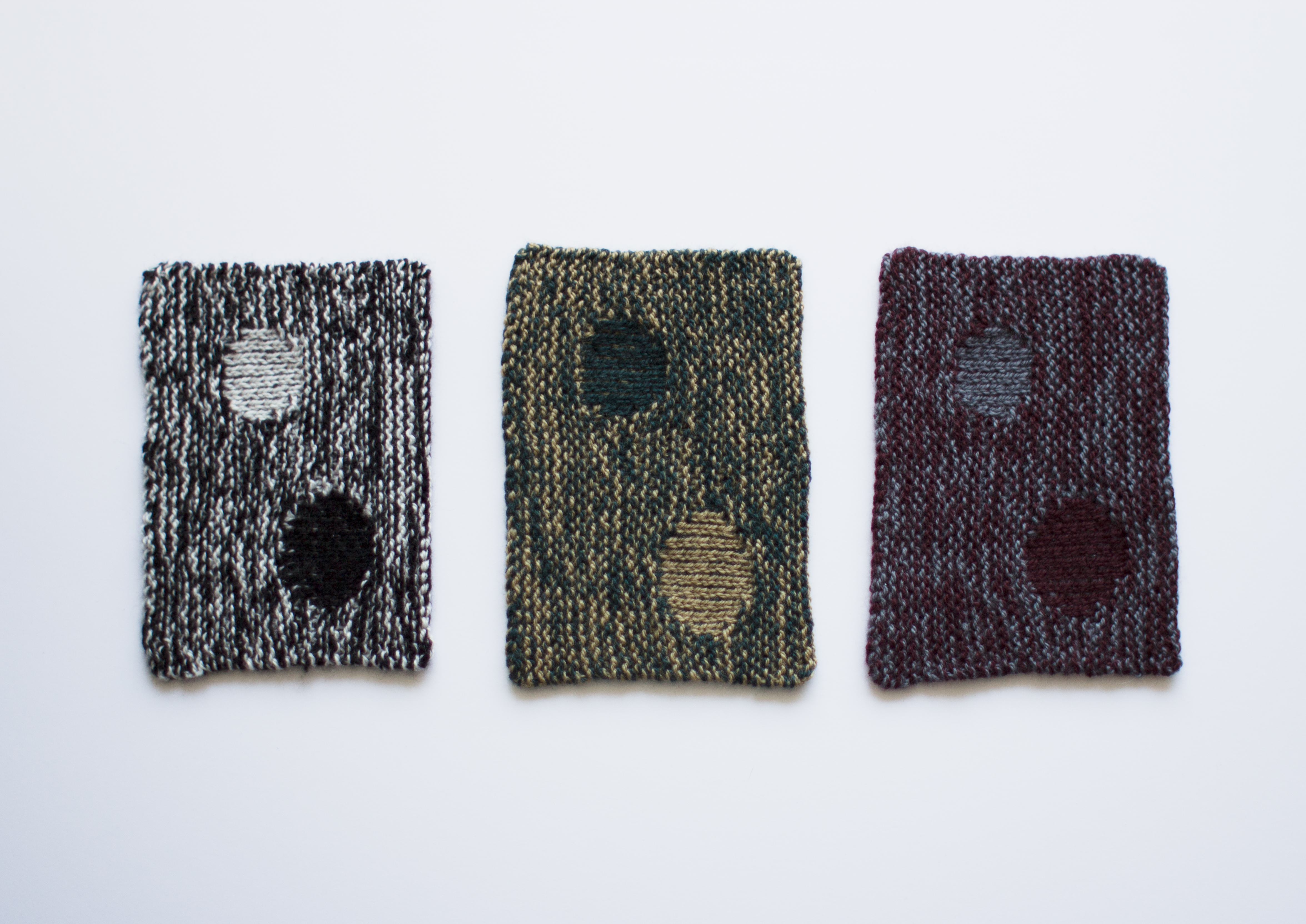
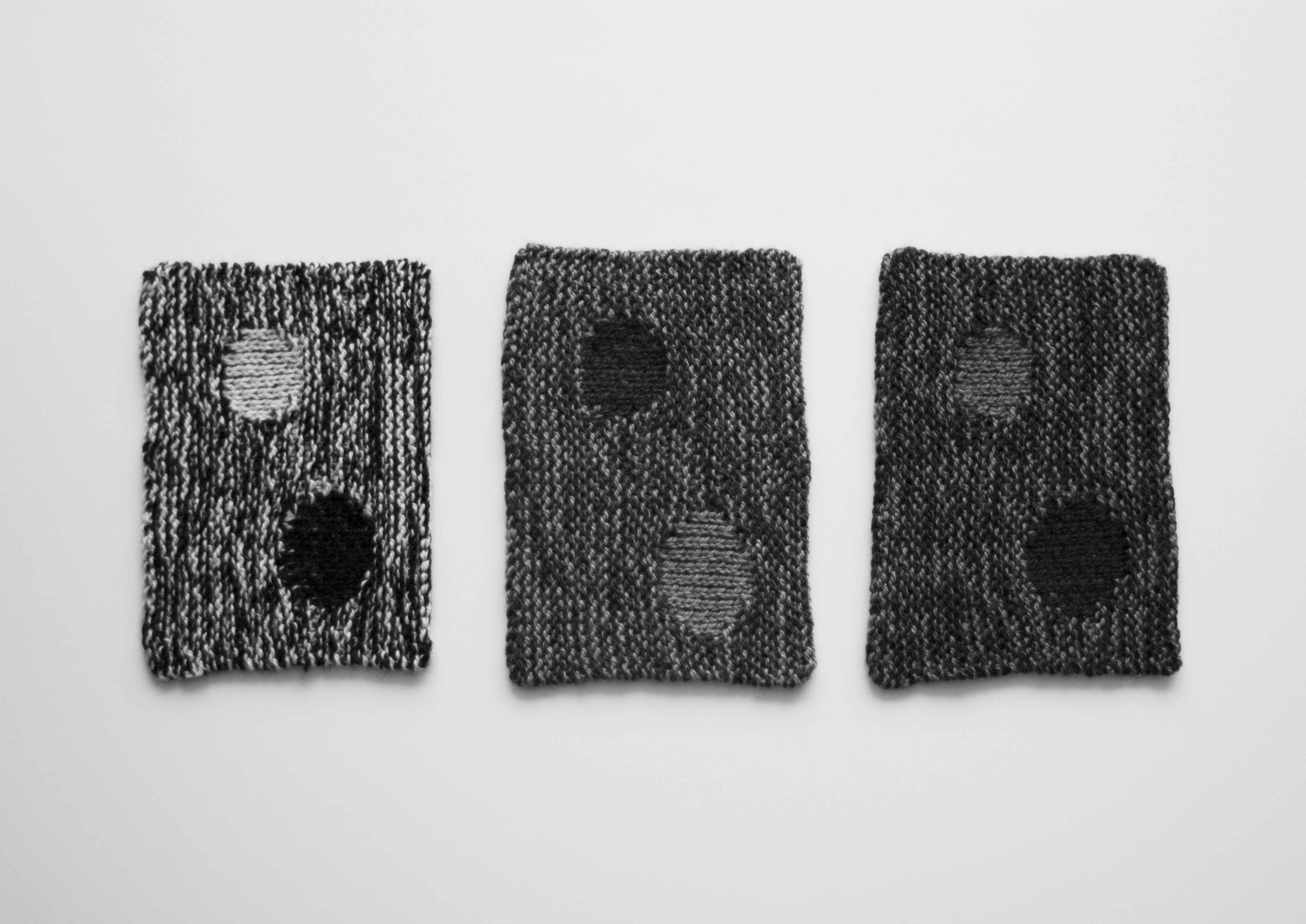
Left to Right : High Contrast, Medium Contrast, Low Contrast.

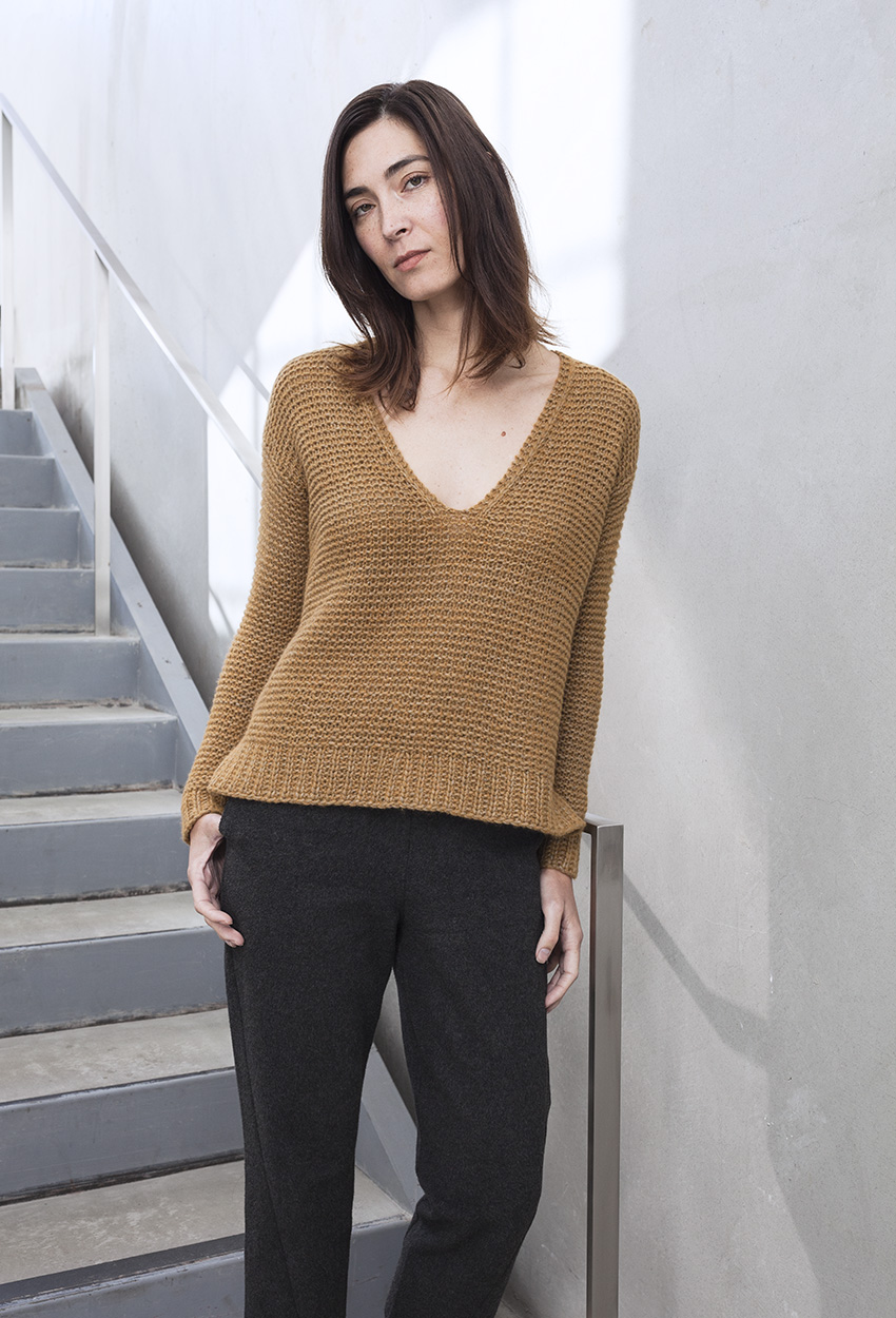
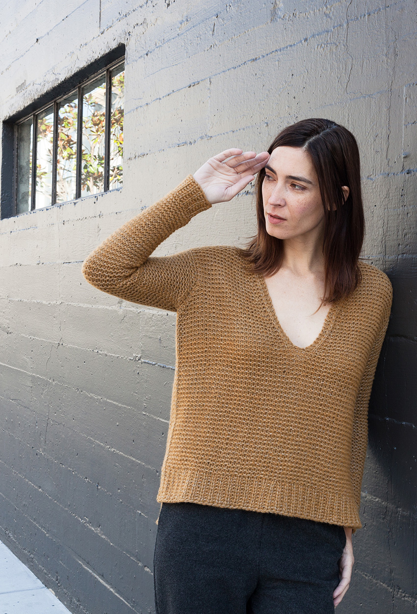
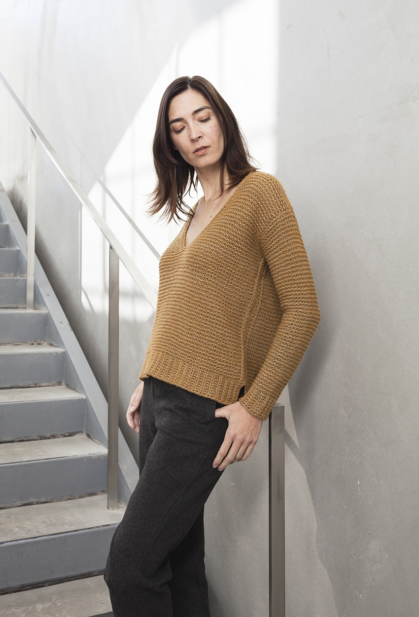
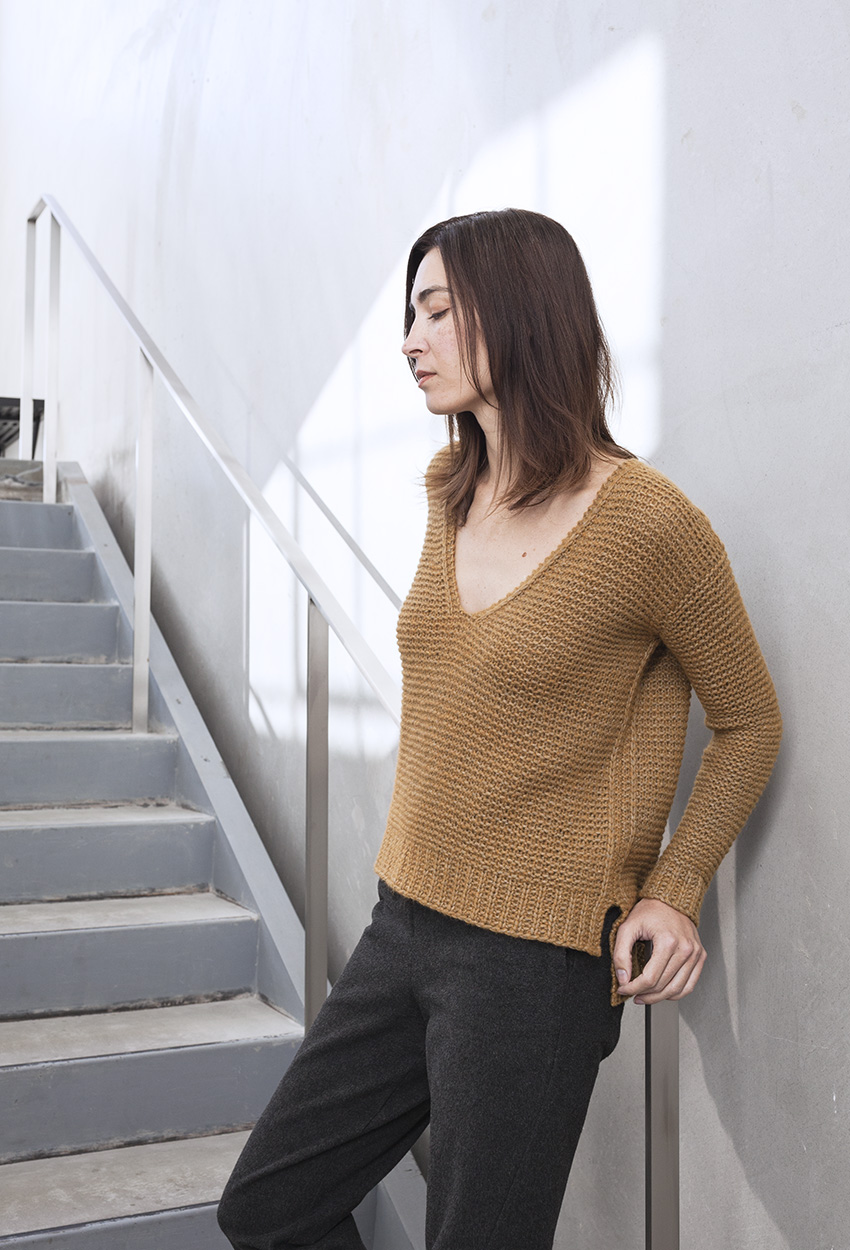
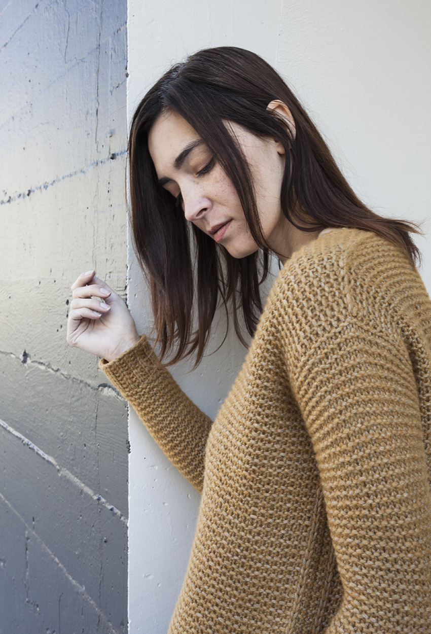
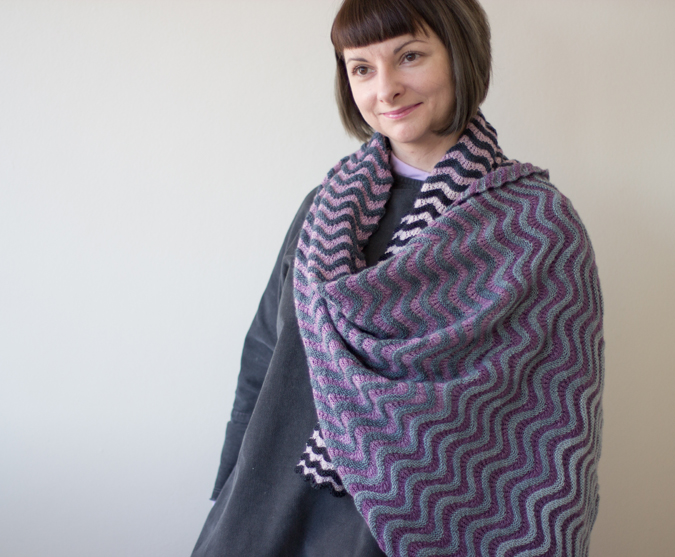
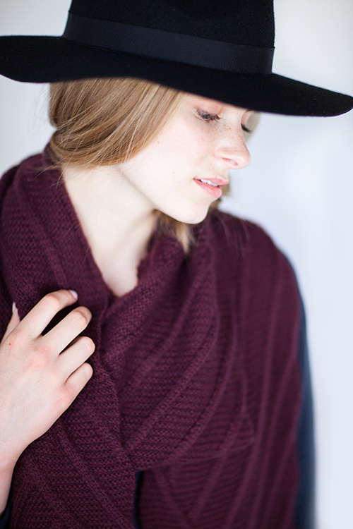
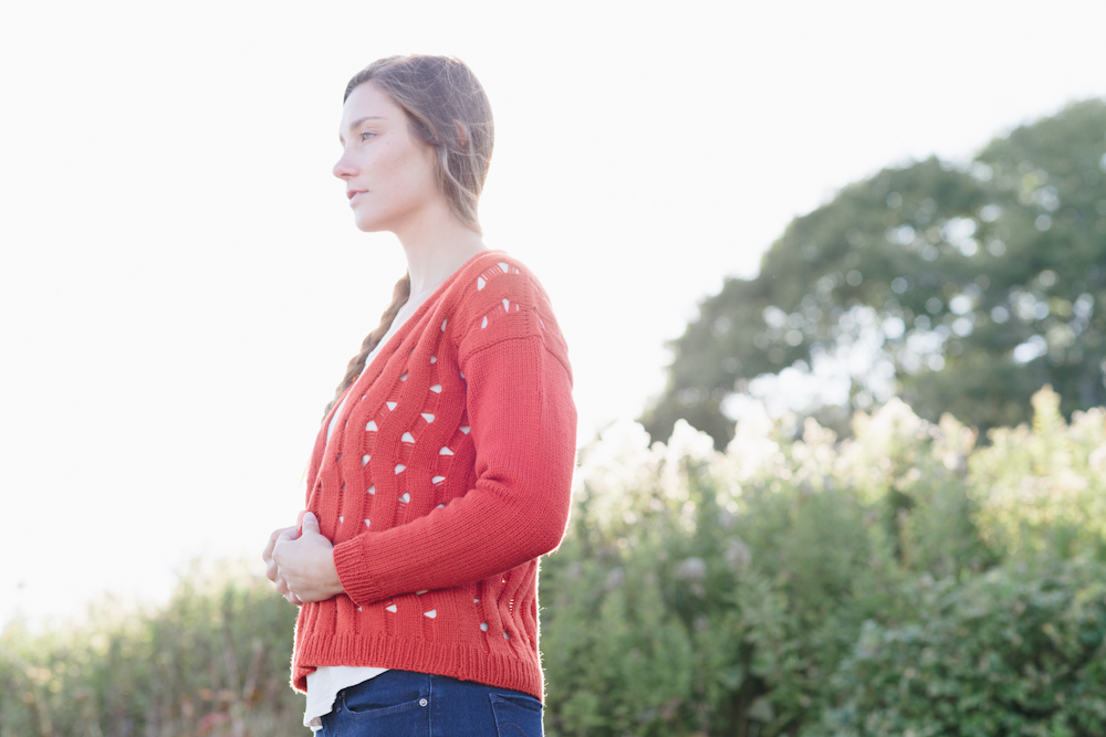
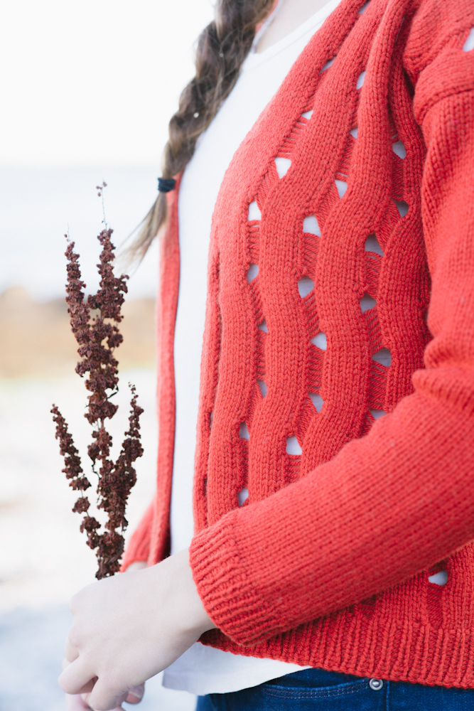
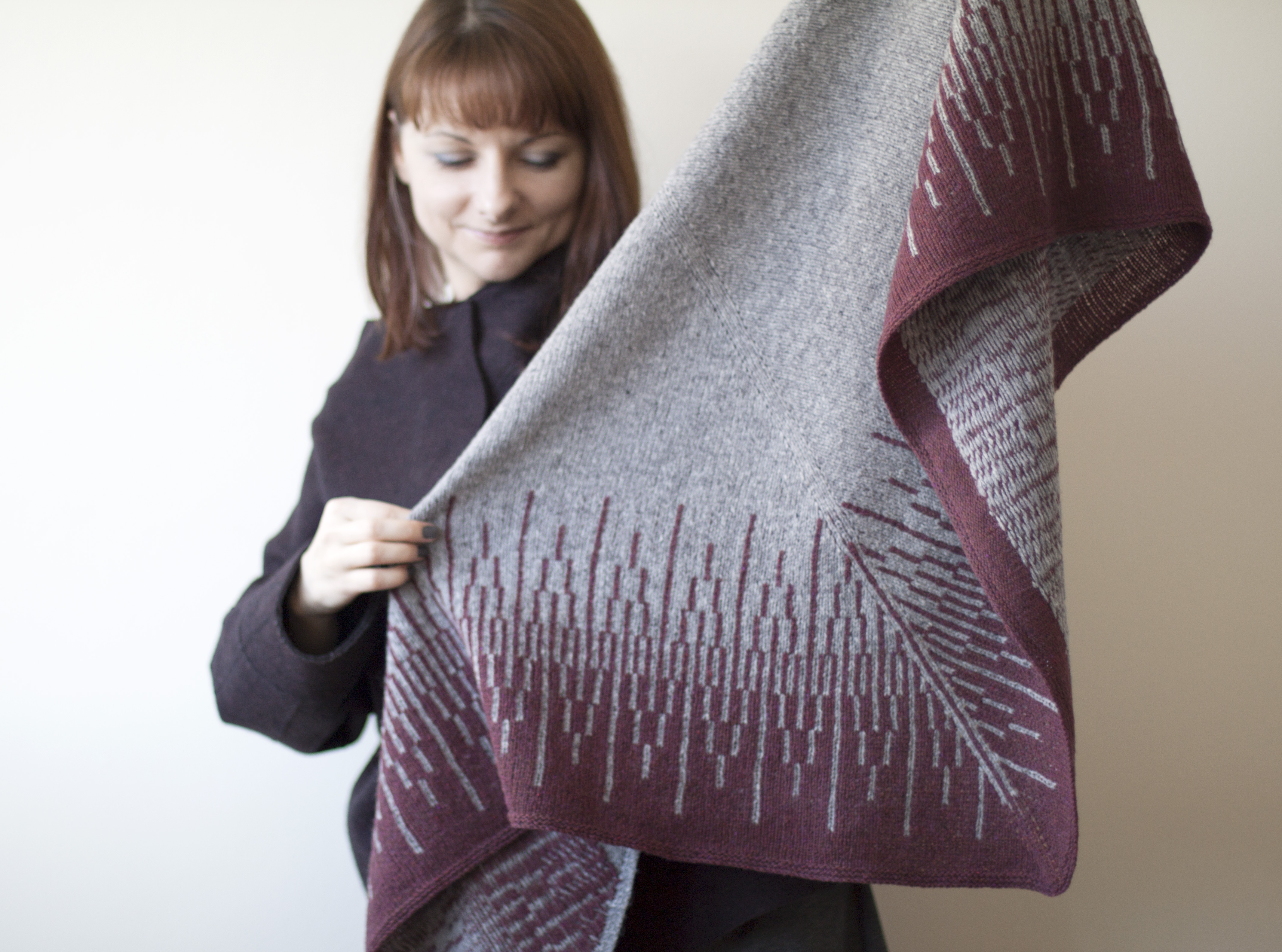
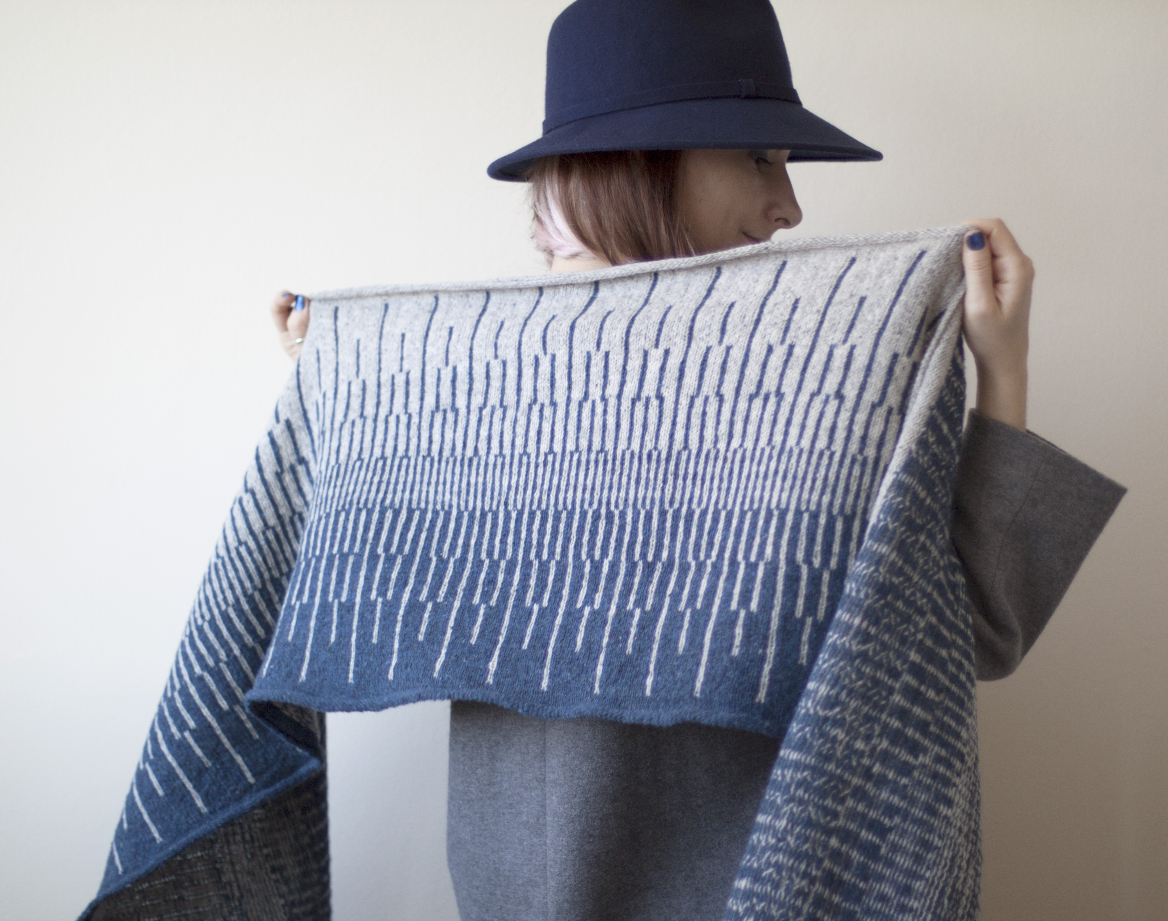
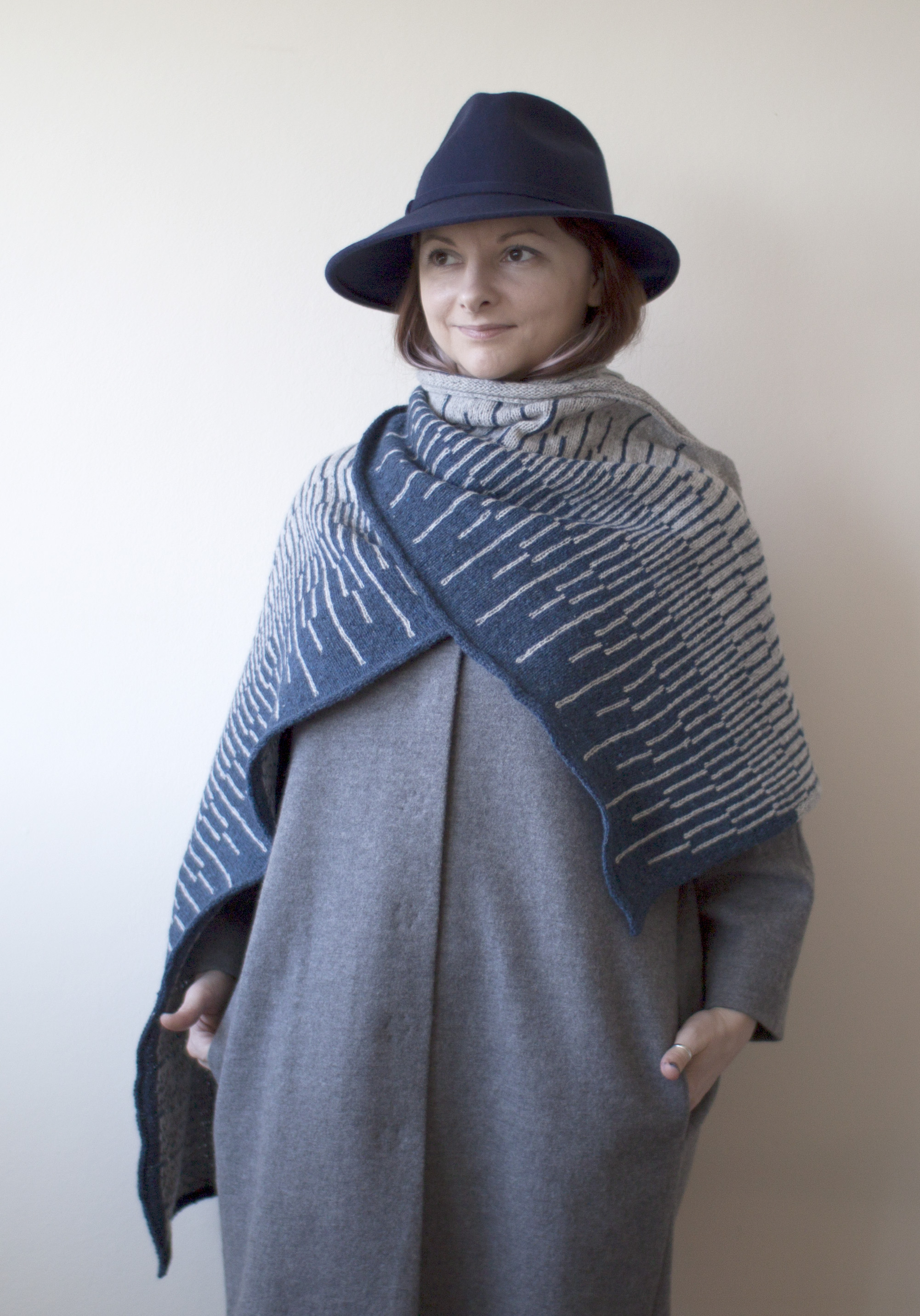
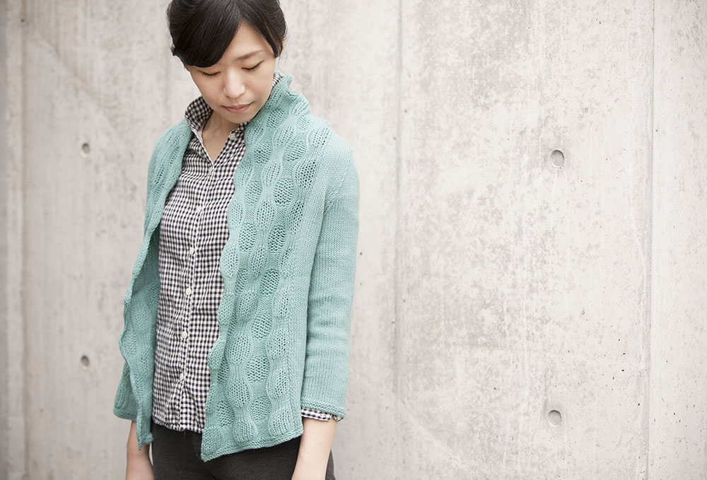
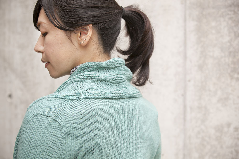
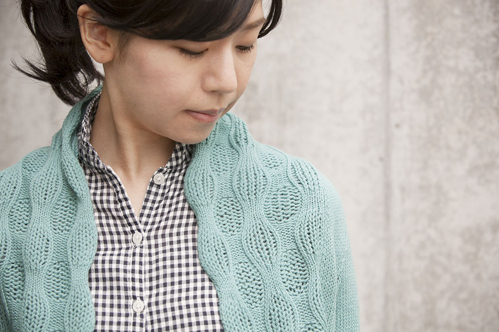
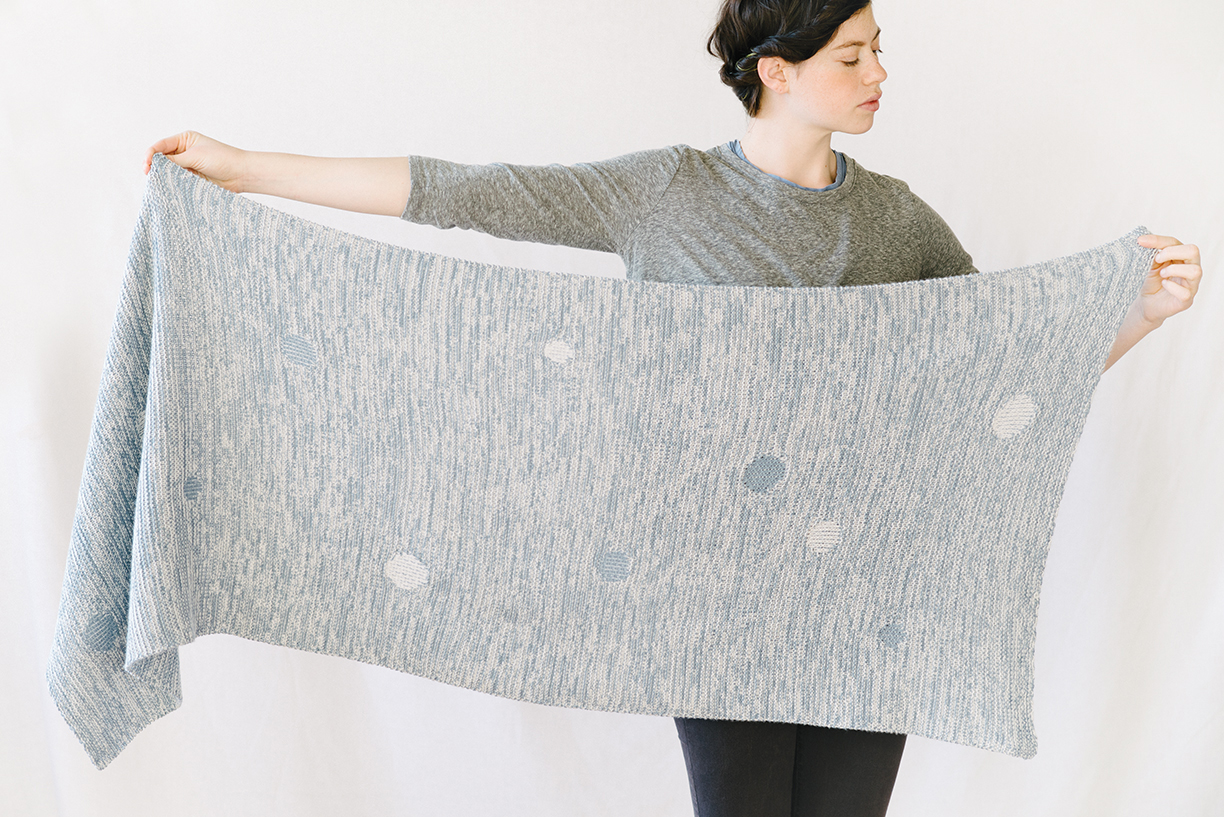
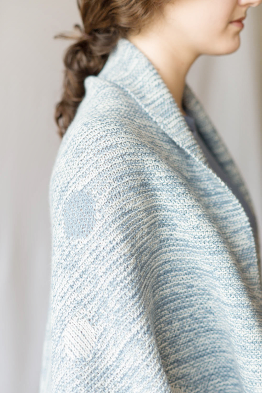
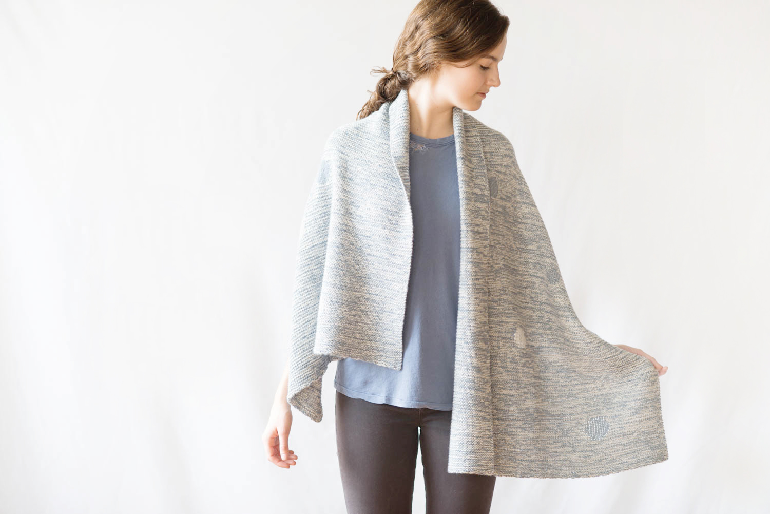
In original Awa-Awa I used Woolfolk Tynd in color 1 (white) and color 9 (light blue), which created a combination somewhere between a low and a medium contrast fabric.

But what’s so great about a range in colors is that you can pick your own and choose how pronounced and sharp you wish your “bubbles” to be visible.

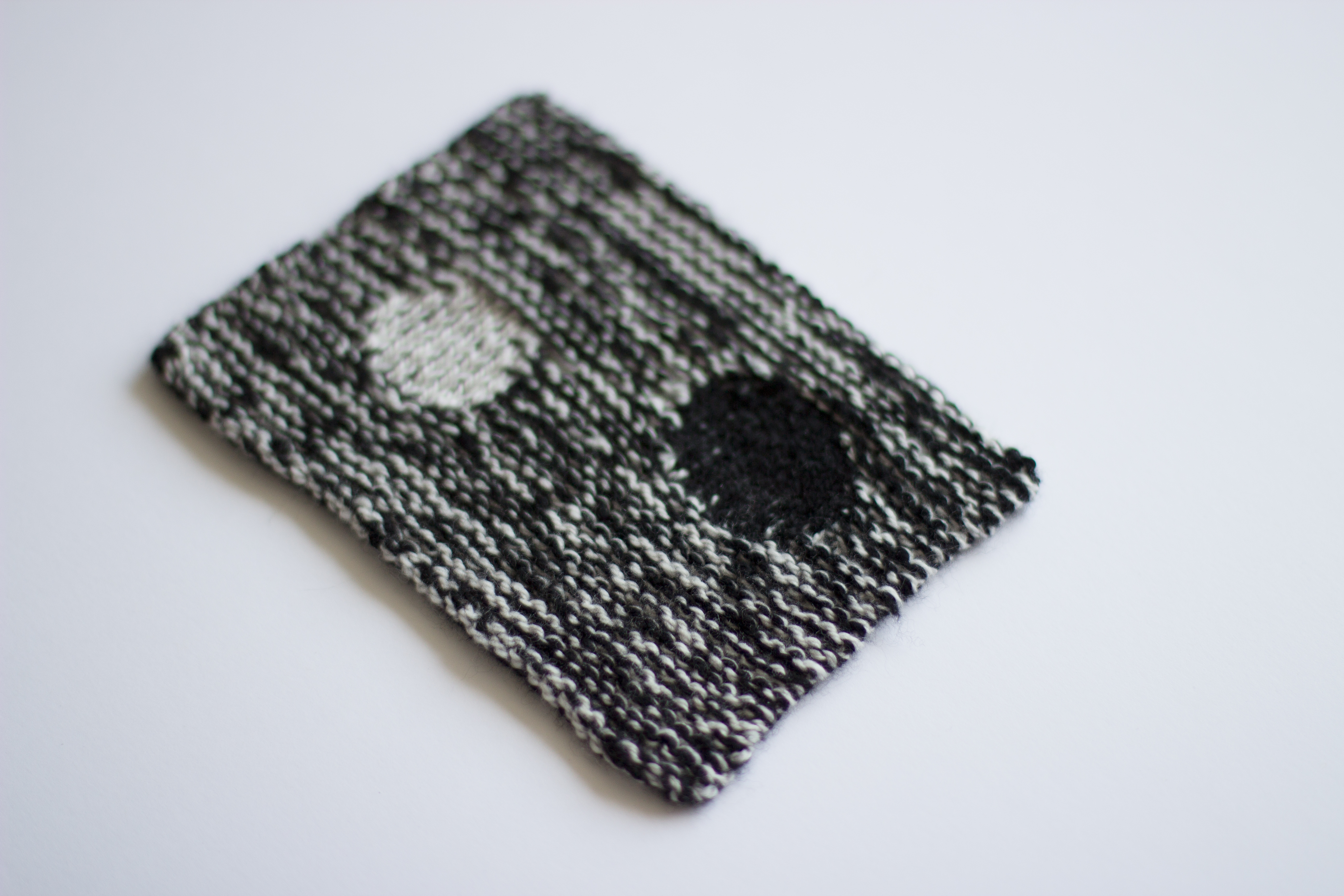
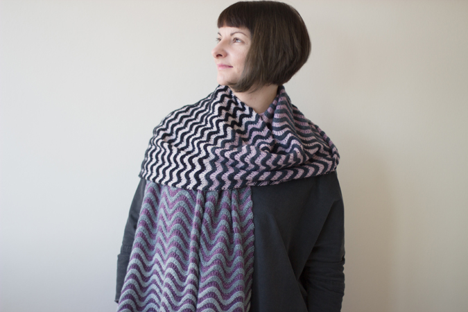
High Contrast Swatch shows the polar opposites and among favorites of mine for daily wear: Black and White. Quite stark and bold as a result, this swatch used color 1 (white) and color 15 (black).

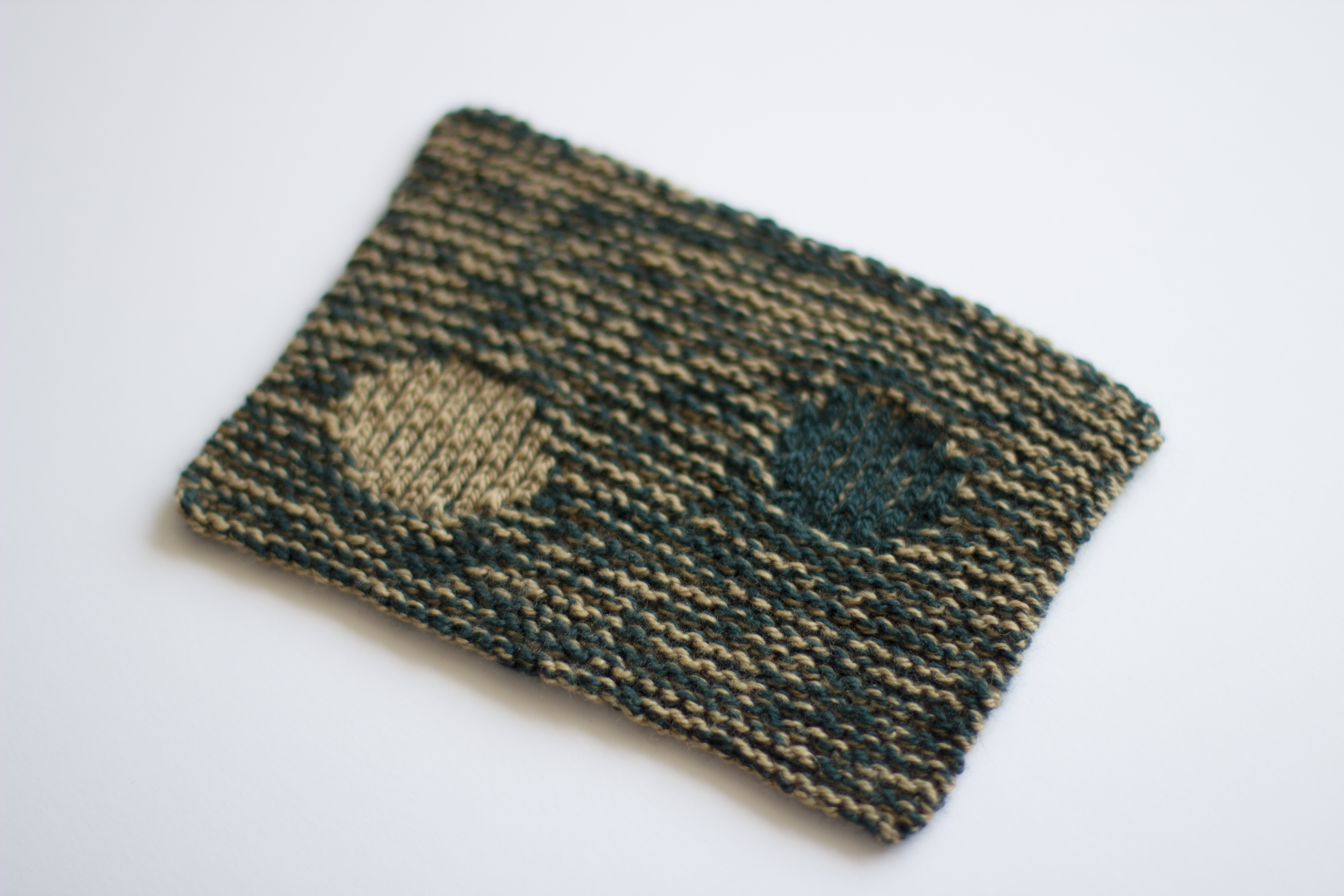
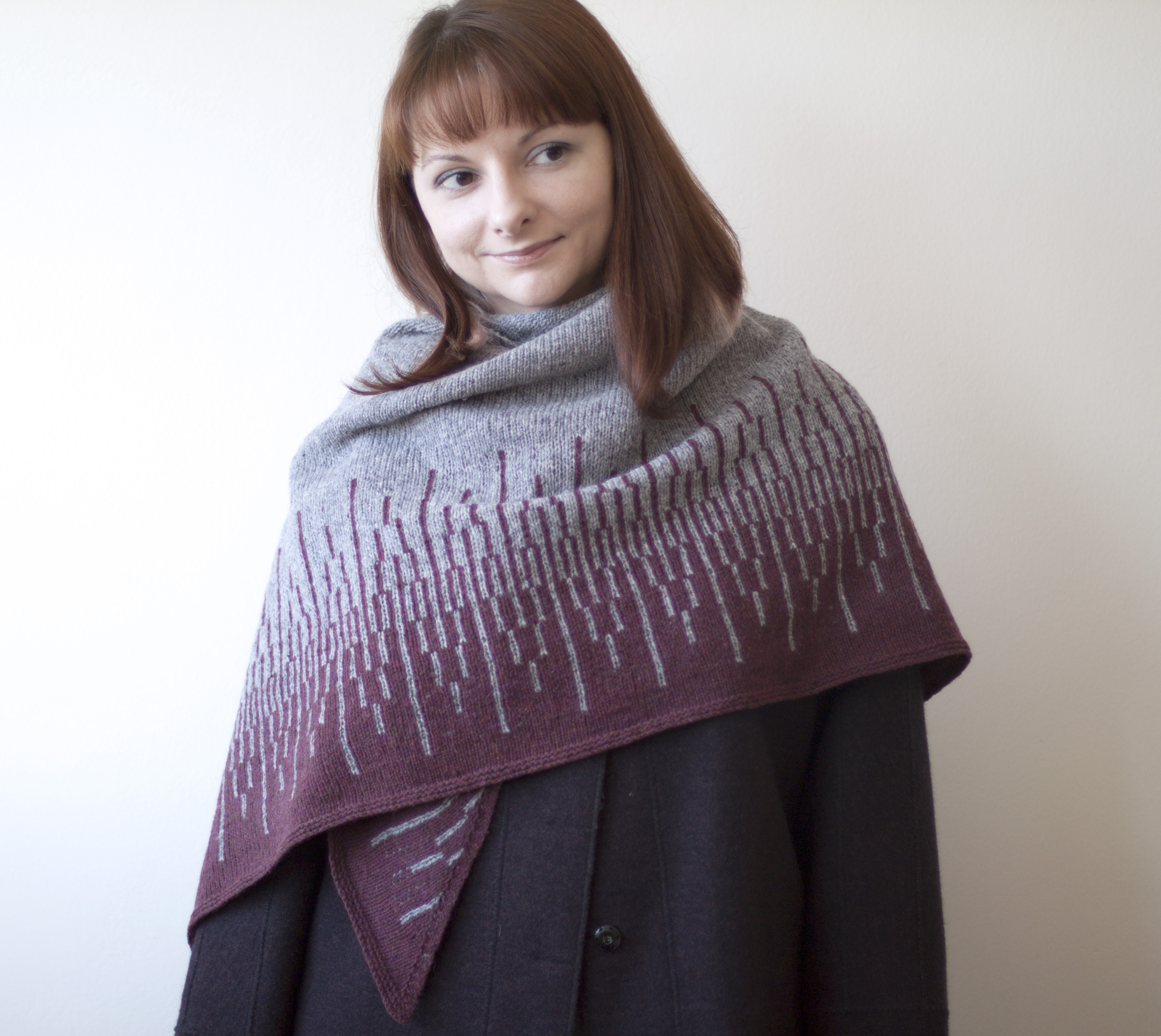
Medium Contrast Swatch has quite a bit of bright color in it, but the effect is moderate and both “bubbles” are equally noticeable without harshness of the lines. This swatch used color 7 (medium bronze) and color 14 (pine green).

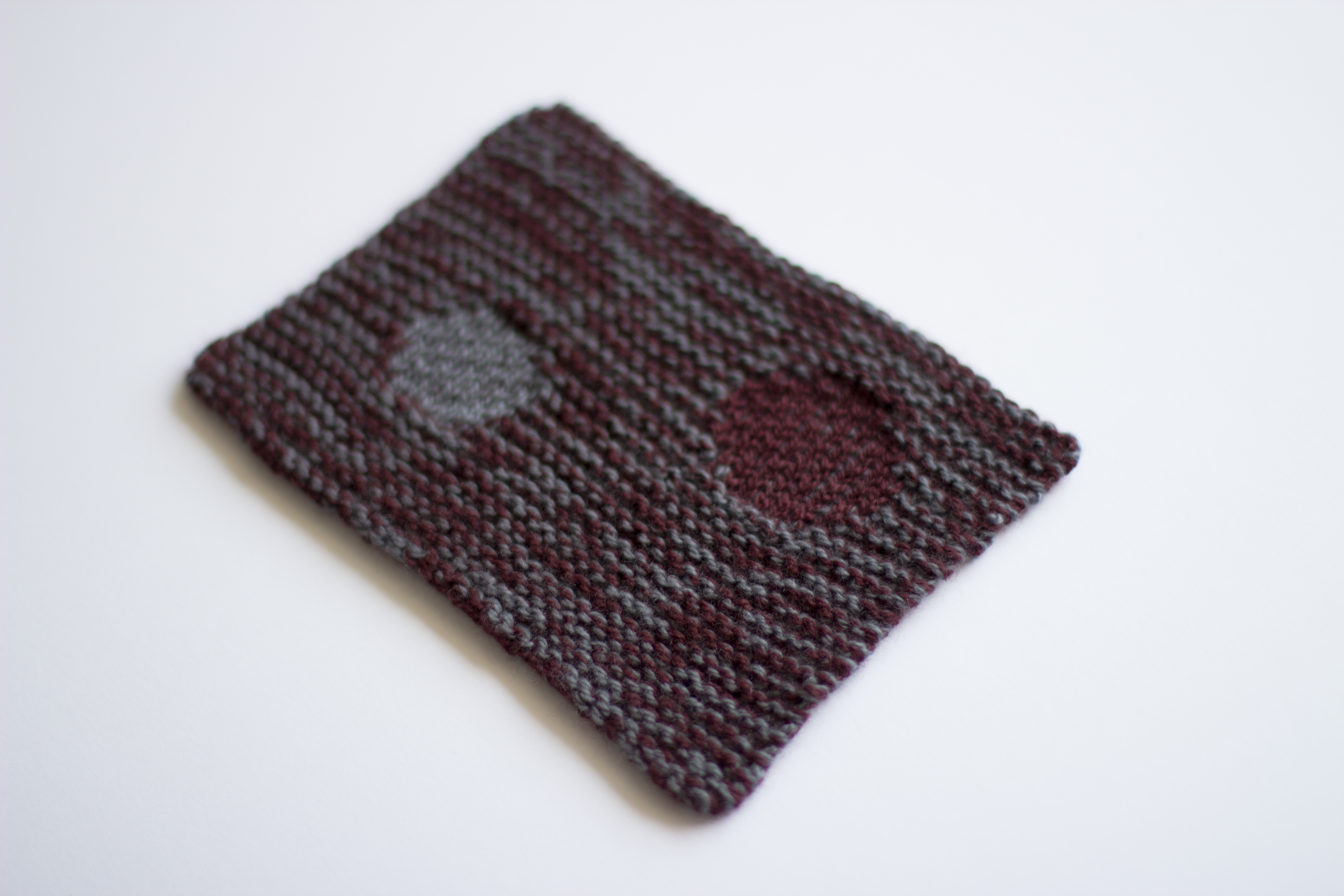
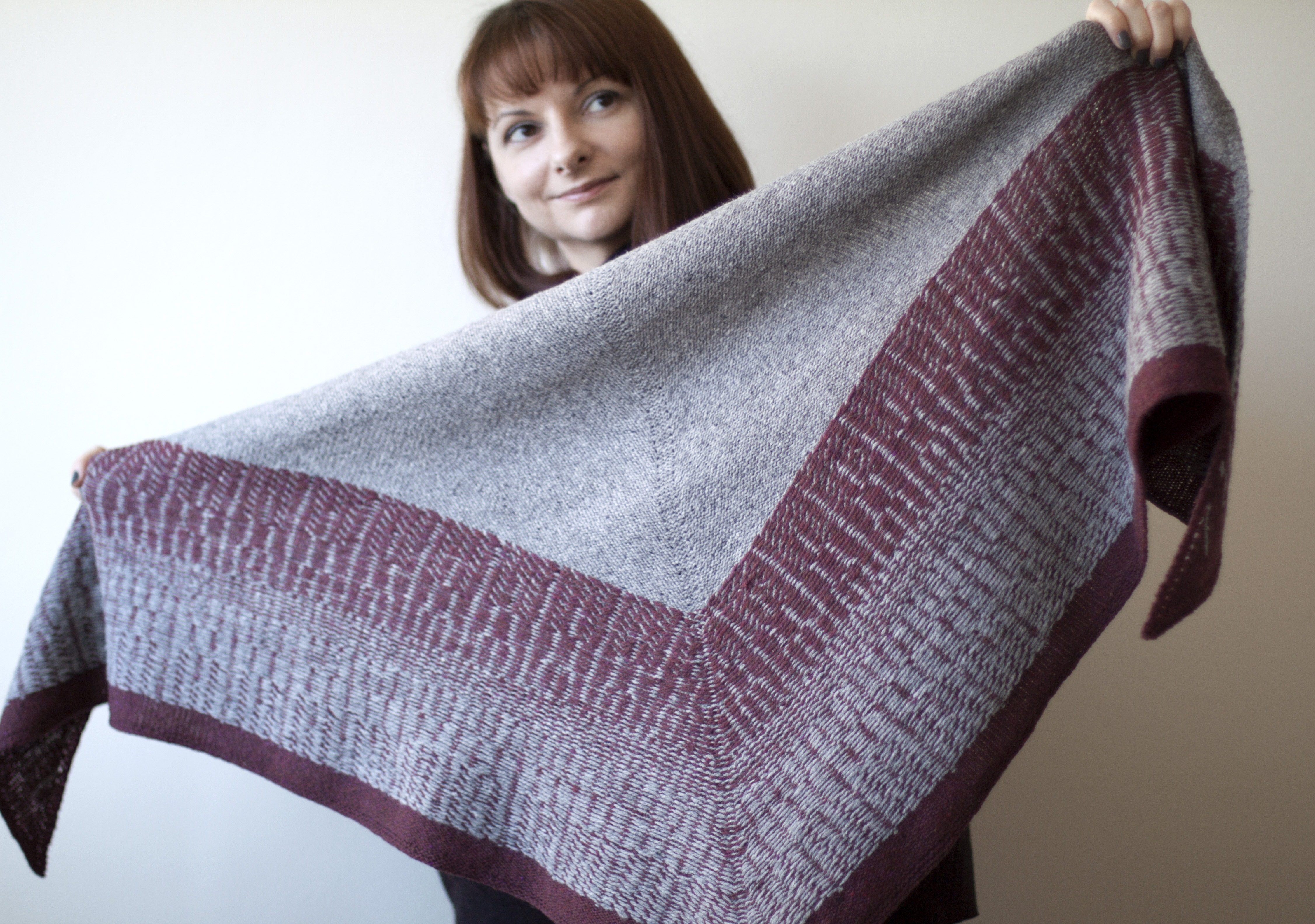
Low Contrast Swatch of mine still shows quite a bit of color, but the values are much closer. This swatch used color 4 (dark grey) and color 12 (burgundy).

And here are the same swatches again only converted into greyscale, where all the color is removed, but you can see the values and their contrast. If you are interested to learn more about picking your colors using value scale, you should read this wonderful 2 part blog post from Jared.

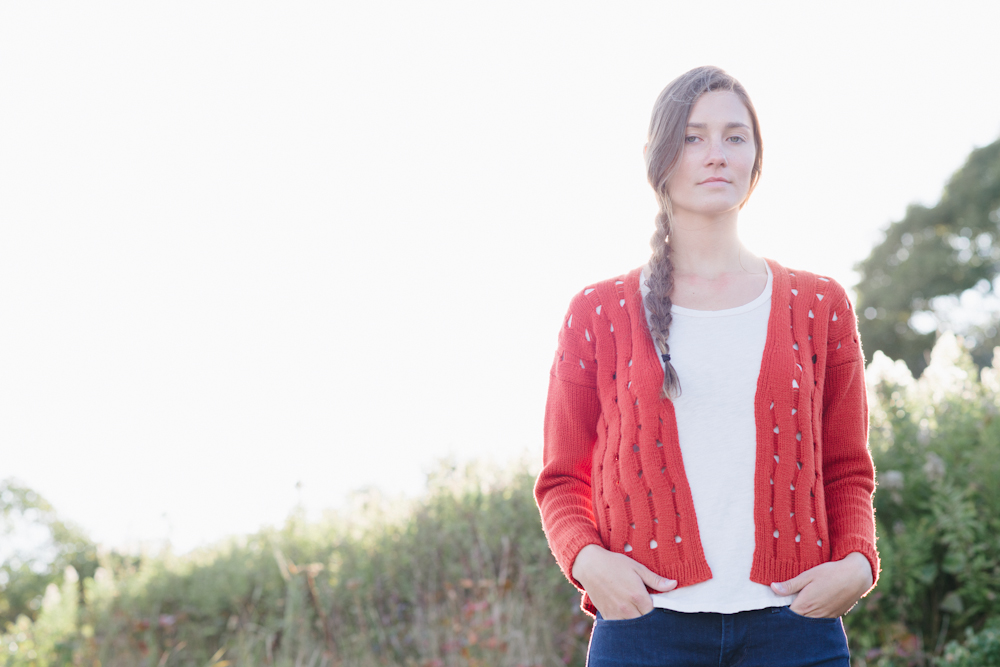
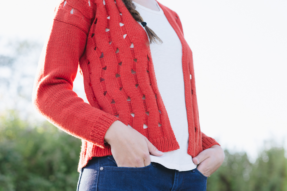
The techniques used in Awa-Awa are not complex, you need to know how to do some basic colorwork here and there. Within the pattern you will find tips and details on how to trap all your floats, and you’d trap them in pattern. Since this is a wrap and you wouldn’t want any floats catching on jewelry or buttons, and it simply makes a nice clean finish on the wrong side as well. With this technique you don’t have to utter world “intarsia” and the shapes that you can create are limitless – circles, diamonds, squares, hearts… anything you desire and put your needles to!

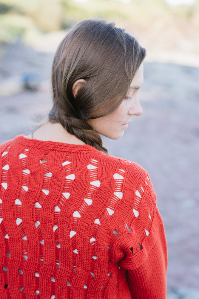
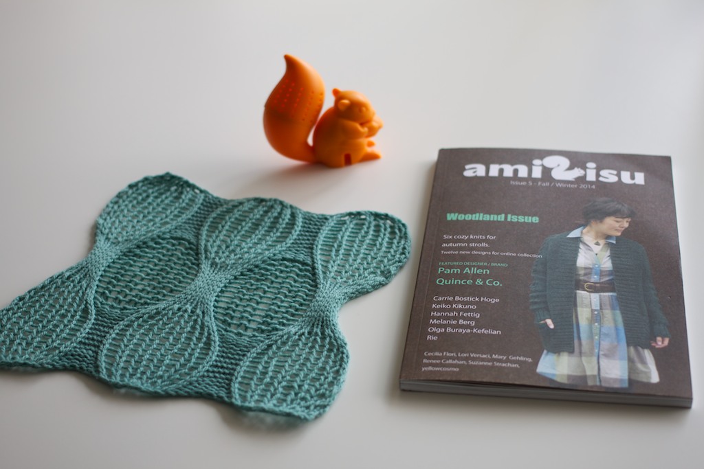
Currently, the original Awa-Awa Wrap sample is on it’s way to Loop London and you will be able to touch and try it on there very soon along with a couple of my other trunk show pieces for the couple of months.

$7.00

GULD is GOLD

…in Danish that is!

But GULD is also my new deep V-neck pullover design for Woolfolk LUFT collection, that just launched on Earth day. I feel lucky to be in this group of talented designers showcasing Woolfolk’s brand new yarn called LUFT, literally meaning “air” in Danish. And it, in fact, feels just like air! What strikes you right away is the juxtaposition of bulky gauge yarn and how extremely lightweight the yarn feels in a skein, but also the feather light garments it produces. And that makes you really wonder what is this yarn and how is it made!? LUFT has an unusual construction of organic pima cotton cage or a tube that gives that crisp feeling once you handle it, but the inside of that tube is still filled with amazing Ultimate Merino® fibers!

Once you have worked through the skein or two, you experience this deja vu feeling as if you are working with cotton, except you are not, not really. The “hand” of this yarn is truly unique, you feel you are being constantly deceived whether it’s cotton as  you might feel the subtle grab on the needle, except the peeking through fibers help it move along and knit up very fast. Once washed and blocked the yarn blooms even more, the tube allows just enough of the fibers to show and bloom through, and the difference in color of the cotton and the fibers create this really dimensional effect in the finished garment or accessory. Just like in my GULD here, the color is L.04, the cotton tube is of medium grey hue, while the fibers inside are vibrant ochre color, and when mixed in they produce this muted, complex, yet sophisticated color.

I wanted to create a sweater design that would feature the most qualities of LUFT and to do that I have chosen to create an updated classic pullover. V-neck is deep but easily can be layered with a camisole underneath. Slipped garter rib trims and all over garter stitch give it this sumptuous all over texture. But modern fit and updated details turn the process of making it fun, while still keeping it as an intermediate level project. Front and back have a little bit of hem difference and a split. Both are worked flat, then seamed at the shoulders with an exposed seam. The sleeves in turn are shaped in the round with sleeve cap for a modified drop shoulder, which is then set in using Mattress stitch. Same seaming technique is used for the side seams. And with subtle positive ease, this pullover is really great for several of the seasons and the transitional weather, whether layered or worn on it’s own, it still feels light as air.

photos ©woolfolk and vanessa yap-einbund

8.00

DENPA

As it’s true for many, most of the process on each of my designs often takes place over a period of time. Sometimes it’s months, sometimes years!
Having ideas in my notebook sitting around awaiting that perfect match with yarn to be made. But sometimes it’s the yarn color(s) that strikes the inspiration pot to start churning.


Last year I was visiting my parents and the weather has been quite typical for their summer, numerous thunderstorms and couple of hot days, but the views afterwards have been quite stunning that I had to document them. As I kept looking at those images when I got back home I got reminded about 2 sets of gradient kits that I got from Miss Babs trunk show hosted at Fibre Space the year before. I’ve bought Taurus and Ursa Major colors without a design or idea in mind, simply because I was being drawn to that unusual color combination.

The rolling cloud shapes are very often interpreted in variety of ways in knitwear, but for striped wave effect I wanted to have the most of color visible as possible! Old Shale is probably one of the oldest stitch patterns around that I could immediately think of when wanting to create waves with the stripes and through years there have been so many wonderful renditions in different designs of it. I wanted to do something different, I definitely didn’t want to do lace. I wanted for the texture to be as much of a key player as the color of these beautiful gradients and with them being worked in a way that would showcase each color when worn. The most exciting part for me as a designer these days is the mathematical puzzle that a stitch pattern can present. Settling in with some graph paper and a pen first, then some charting software on the computer, I created first couple of increasing motifs that made me giddy with excitement as I dug into my swatch. How long and how wide… but the idea of having all this is shaping to be incorporated directly into the patterning indeed have worked out!
Math, you thing of beauty that make this knitter’s heart sing!


I rated this pattern as Beginner Intermediate, which is a rare one for me. Those who have knit several of my patterns know that I love puzzles and creating patterns that teach or have some unusual twists to them! All you need to know is to how cast on, knit, purl, increase, decrease, bind off! I am also offering a narrower, scarf-like size of Denpa, just in case you are not used to or not keen on wearing wide shawls as much!


The thing about stripes is that if you cannot find a gradient kit available to you or if you don’t have enough yardage, you can easily customize and substitute the ombré dyed yarns with solid dyed colors. Find a yarn that you love and that has a big range of colors available, so that you can build your own gradient. And it doesn’t have to be 2 gradients, you can choose to do 1 gradient but for the contrast pick one color only that would compliment and work with all of the colors of that one gradient. You can put the solid color into foreground or into background. You can do the entire wrap in 2 colors only. The choices are endless! Just let your creativity and imagination loose and I am sure you can find the right color and yarn for your Denpa to make it unique, and to enjoy knitting and wearing it!

You can find more details on Denpa pattern here. And don’t forget to check Denpa projects already in progress on Ravelry.
Remember, if you share your project on social media/Instagram, make sure to tag it so I can see it #denpashawl

7.00

woolfolk

Let’s start this year with luxury! Isn’t that a good New Year’s resolution, especially if you are all about new yarns and new adventures and other things new! Even though this yarn and collection were launched late last year, I feel like right now is the time I can look back and reflect on this whole process and development of how it came to be.

IMG_0327

Around May last year, Kristin Ford, who I have worked with previously, shared her ideas for a new venture and quite unique fiber that she has discovered and that noone in the North America was offering to hand knitters. I was thinking we were already quite spoiled here with a wondrous fibers available in yarn form, so this was very intriguing. I think the moment I have touched the skein, my words faltered in trying to describe the feeling. It was just undecipherable “Ahhhh!” and “Mmmm” followed by questions in my head – How?? How?? How is this just a merino!? I have knit with fair share of merino yarns before and they have been very soft but nothing felt like this. I don’t think cashmere yarns I have knit were often even this soft before wash. To learn the why’s and how’s of this amazing fiber Ultimate Merino® please head over to the WOOLFOLK’s website to read and watch a beautiful video about Patagonia region and the efforts for the grassland regeneration. To add more, each company that is part of this project is paying back the farmers to continue helping them to continue maintaining sustainability and quality of the fleece. So when you pay for it, you contribute to that as well!

IMG_0410

Now as for the yarn, Clara Parkes of Knitter’s Review was among the very first people to touch and graciously review the yarn and you can read her detailed description of experiencing Får here.
Woolfolk yarns currently come in 2 different weights – FÅR is a Worsted weight, chain-like construction and TYND is a fingering weight is a nice 2 ply twist.

IMG_0368

When approaching ideas for designs in these yarns, I tried to go a different route than I usually pick when designing olgajazzy patterns. The quality and luxury of the yarn itself was dictating or even demanding the minimally textured, classic, yet clean and conservative modern knits approach. With well-thought out details through medium of construction to keep any knitter’s brain occupied, but not requiring every bit of concentration, so knitting itself is enjoyable. You and your Woolfolk yarn need some quality time to truly appreciate the tactile enjoyment of working with this yarn. And with a great knit result that can be worn on any occasion when you wish to wrap yourself in a cloud.

(Click each image or design’s name above it to see more images of them).

KNUS

WOOLFOLK-4115_lores

FLET

BYGGE

WOOLFOLK-4244_lores

Small details and accents that draw the eye, but are not distracting from the fiber of the yarn and overall look of your knit.  These knits have no time, no age, they are the kind of knits most of us want to wear or do wear every day, Woolfolk just adds that doze of scrumptiousness.

KNOP

WOOLFOLK-4368_lores

SKYGGE

WOOLFOLK-3887_lores

As I was editing through my process I have found it quite satisfying. The yarns  and the collection read very Scandinavian-style to me just like the founder’s ancestral roots  and make me proud to have created something absolutely new to me. And reminded myself why I collaborate on projects like that, to make me step out of my comfort zone and learn something more about myself as a designer. As the moment we stop pushing ourselves and trying, creativity tends to stagnate.

RIBBE

WOOLFOLK-4031_lores

FURE

WOOLFOLK-4498_lores

VINKLER

WOOLFOLK-4285_lores

I want to thank everyone who has already knit many many sweaters and accessories and wrote about this collection,  I am truly humbled that you love it so!
I want to thank Kristin for creating such a unique opportunity and for her unique vision and my brilliant friend and Ori Ami Knits co-author, Vanessa Yap-Einbund, who did an amazing job on the collection’s photography as well as Woolfolk‘s  (and mine!) websites.

HAPPY NEW YEAR! And in celebration of it – the luxury giveaway!

I am giving away the entire (8) printed  patterns WOOLFOLK COLLECTION FW 2014 as well as a skein of Woolfolk Får and a skein of Woolfolk Tynd to 2 lucky winners!

Please leave a comment below until end of Tuesday, January 6th (which is going to be my Xmas eve) and I will draw the winner the following day!

Good Luck and Happy Knitting!!!


all of the elements

/

Almost a year ago, Carrie Bostick Hoge of Madder asked me to join an exciting project that she has been thinking of along with some of the other wonderful designers called ELEMENTS. When I joined in, FIRE was among remaining elements and although I do wear and love an obscene amount of grey in my wardrobe, orange is my favorite color. I am just very particular about the shade of it, I like it on the red side more than yellow as that is the orange that looks best to me. And at that time I had just discovered that Quince & Co came out with a stunning new shade called Poppy and this cardigan was destined to be in that color and I have picked Quince & Co Lark, I lovely worsted weight 100% American wool. Which joined in harmoniously with the other ELEMENT yarns already lined up with the other designers.

roaring_fire

flare

I have worked previously with Carrie as you might have recognize her signature and style of photography from my “Circles+ Dots“collection that I have created a while back. True to her vision, she has created a wonderful story and a dreamy visual to show off the knitwear at it’s best, including my Fire Cardigan.

fire_cardi1

fire_cardi2

fire_cardi3

The stitch pattern for Fire cardigan took some time to develop as I wanted a stitch pattern that would translate not just through color but possibly texture. And in the end the textured meandering pattern of this oversized cardigan was created to correlate with the element of fire. It reminds me of the tongues of flame, licking at the air on that last summer campfire as cooler weather sets in. Being a cousin to the stitch from my Moko-Moko Cowl design it has the unusual modular process of building the knit fabric which creates the intricate surface design, juxtaposing positive and negative spaces of knits. Culminating when the stitches are dropped at the very end, revealing the true texture of the cardigan. The uninterrupted mold of stitches continues to form neckline shaping while keeping ribbed edges intact.

fire_cardi4

fire_cardi5

Drop sleeve construction and positive ease allow this boxy cardigan to drape loosely over the body, allowing for layering as well as fitting in a way that creates slightly raised front hems without requiring extra shaping.

fire_cardi6

ELEMENTS is currently available for purchase in a variety of options:

Limited Print Edition + eBook Package

eBook Only

All of the patterns are available as single pattern pdfs as well.

fire_cardi7

Today I am also excited to be giving away a copy of the limited print book edition of ELEMENTS.

The rules are simple, for the next 5 days just remember to leave me a comment on this blog post. The entries will close by the end of the day on Friday, December 12.

Good luck and Happy Knitting!


ONPA WINNERS

Congratulations to Awana, Suzanne, S.E., Ada and Kathy for they are the winners of ONPA shawl or stole pattern!

Thank you everyone for participating! I promise there are more giveaways in the near future as well!

ONPA knitalong has now kicked off, but some are still at the yarn picking stage. Stay tuned for a new post on how to pick the right colors for you!

Here I leave you with the image of my Onpa Shawl knitting in progress in Grellow colors in Brooklyn Tweed LOFT in Soot and Hayloft and my tea in NPR mug. I love that their address 1111 is very similar to the actual patterning happening in the shawl. When things just couldn’t have gotten more relevant than they already are! Hope you can join me this winter for the Knitalong!

nprkal

ONPA

It feels like forever. I have been working and waiting to publish these designs for a while now.  Meeting all the deadlines I’ve committed to, preparing, re-organizing. Waiting for that perfect moment.  One may wonder why it takes me this long to “birth” pattern designs into the world, but I feel the further I work with knitwear design, more I strive to perfection. And end up spending more time concentrating on quality of my patterns, editing and testing them and then editing again. And all of those things take time.
I have been exploring combining colors for ombré / gradient effects before via use of solid yarns. If previously, in Aranami, I used a modular technique worked up into a design, for these new designs I have been wanting to try another technique I’ve worked with before! Would some of you recall my Trace vest from Wool People 3? Similar, but not the same. And that’s why it’s new. But first I will start at the beginning of this story.

NPR_hq

Rewind back to Summer of 2013, when we just moved back to DC area from Japan and dear friend Emily invited us to the friends and family day at new NPR – National Public Radio – headquarters in Washington, DC. Besides the privilege of visiting and touring this new building, it was a fun experience on its own – seeing the studios, people at work at news station, the Tiny Desk and enjoying stellar views of DC. It was great to see one of nation’s respected news channels from the inside and a spectacular view of the newsroom floor from the bridge.

NPR_newsroom

While exploring around the building and its new, minimal and fresh hallways, my eye caught upon a certain wall decor simply depicting the sound waves.  My friend told me, that her work a lot of times consists of staring at those “waves” on her computer day in and day out. So seeing that sound wave graphic incorporated into interior design felt like a great idea. The subtle changes of grey into white and going back to grey which triggered my thought of using similar pattern in trying to depict ombré, color gradient in knitwear and in this case by using colorwork technique.

NPRsoundwave

Colorwork can be both – intimidating and frustrating, beautiful and rewarding! I do not consider myself a colorwork connoisseur, but I have turned to it multiple times to reach the desired effect in a knit garment or accessory. And every time it was worth all the efforts and patience. With every project my confidence grew and my skills have been getting more  practice. I have discovered better ways for me of working it and making little discoveries and tips that might help other knitters with their process. I admire designers who are almost exclusively create and design with colorwork and fair isle. They are truly an inspiration to me. One has to have a good eye, taste and knowledge for harmonious color pairings to turn tiny intricate patterning into wonderful garments.

Back when I was working on Trace I’ve been fantasizing to use that similar effect for something else, a different graphic, a different clothing item. So when I had begun my stitch pattern development I have been reverting to the similar color distribution and usage. I’ve had begun by obsessively swatching and trying to find the best possible way to work in more colors. I have knit a shawl prototype with 5 different colors, however the colors I used were not close enough in palette even though they were in the same color family. Their contrast was quite stark and to me it didn’t feel right for what I was trying to achieve. Unfortunately, not all ideas can translate and work out in a different stitch pattern. Now, months later, I know how I might have solved that issue but it would have given me a bit different design than I had originally planned. Thus I have abandoned the idea and decided to go a bit simpler route and work with 2 colors only.

onpast6

onpash3

I have picked an already trusted Brooklyn Tweed LOFT yarn, knowing how reliable and perfect it has been behaving in my hands while doing colorwork. Squishy and lofty, just like a marshmallow, all while having enough “grab” to maintain even floats. Easy to spit-splice and colorwork that will lay flat and even that when done properly would look great on the reverse side.

Other biggest excitement in my process while working on this design was picking color. For triangular version – Onpa Shawl – I’ve chosen a slightly muted burgundy that is called “Homemade Jam” and paired it together with the heathery “Sweatshirt” grey. And for rectangular version – Onpa Stole – I went with the beautifully saturated blue “Almanac” and winteriest color of grey “Snowbound”.

I knew the moment I cast on for the triangular version that I must make the rectangular version available as well.

So what’s the difference,

Onpa Shawl is a triangular version

USD 7.00

onpash4

Onpa Shawl is worked flat top down and uses techniques like provisional cast on and working colorwork flat. Meaning that you not only knit, but also purl while maintain color pattern. I am a Continental knitter (the combination kind) and many years ago I’ve taught myself how to knit English style, just so I can use stranded method and work with both hands carrying a color while doing colorwork. But because I am mainly Continental style, I have discovered that use of this nifty little tool – Yarn guide – helped me speed up my process while producing even floats. Mind you, that it does take some time getting used to, but I’ve heard amazing things from Continental knitter friend of mine who works her colorwork in the round now at incredible speed and she helped me in producing of the stole.

Onpa Stole is a rectangular version

USD 7.00

onpa4

And that brings me to Onpa Stole. This design has more potential from wearing point and offers more customization options . Because the way this pattern is worked and built, you can make it not just as a stole – you can work less row repeats and turn it into a scarf which would be just as graphic. You can play around with the number of the repeats, work double width, but reverse the orientation to create a beautiful throw or a blanket. You can cast on less stitches and omit the steek and turn it into a cowl. So versatile!

onpast2

One of the goals for these shawls was also to discover a better way for trapping my floats in a neater way, I am so glad that I have succeeded and more. The floats trapped in both of these designs in such a way that renders them both reversible, while creating slight patterning of their own. I am especially happy with how the colors look in reverse gradient on the back side of the shawl and I have included all those tips in the pattern.

onpash5

onpast11

Even now I realize that the possibilities are quite infinite for either of these. Imagine using ombré  yarn as a contrasting color all the way through. Or use 3 or 4 or 5 solid colors in a color progression but only use them in a contrasting placement in the pattern. I am currently knitting another Onpa Shawl for me using colors of Brooklyn Tweed LOFT in “Soot” and “Hayloft”, those who know me are aware of my love for all things grellow and I am quite excited as I have chosen to reverse the color placements and made lighter color as a contrast this time. Can’t wait to show you!

I will write more about these designs in the upcoming weeks as I am hoping you will join me in this Winter’s ONPA Knit-A-Long hosted here and in my olgajazzy design group on Ravelry.

GIVEAWAY

5 lucky knitters will be gifted with a copy of either Onpa Shawl or Onpa Stole digital pattern.

The rules are simple – leave me a comment here at the bottom of this blog post and please follow me (unless you already do) on Facebook and Instagram

I will draw winners on Thursday morning October 30, EST.

Happy knitting and Good luck!


Save

Save

Save

Bubbling up

The whole time while living in Japan I’ve been admiring the abundance of modern architecture that spread throughout the entire Kanagawa prefecture and specifically Tokyo. So when Meri of Amirisu asked me to design a garment for their architectural issue my ideas immediately floated towards my favorite building in Tokyo – Prada building in Aoyama that was designed by Herzog & de Meuron agency in 2001-2002. The unusual structure in itself is the most fascinating thing about it, but for me it is the surface that is covered in convex and concave windows that in a pattern form the random bubbly impression. The thick glass structure captures the light in the most amazing ways, depending on the time of day you are witnessing it. So during most of my day trips to Tokyo if I ever was in the neighborhood, I would visit the building and say hello and snap a photo or two just to admire it once again.
IMG_8348

pradabuildingaoyama
And as you can see here the building looks so different during the night hours and you can even spot the different colored cells from the inside that allow the company to decorate yet be visible on the outside.
pradayellowblockAlas, delegating can be hard at times when there is a lot at work simultaneously. Unfortunately, I was too late with my cardigan to make the deadline of the architectural issue. So Abuku cardigan (from Japanese meaning “bubble”) was published in the newest woodland issue of Amirisu. Abuku cardigan certainly started as a design from the ways of thinking up of numerous ways possible to translate the impression of bubbles into knitwear.

I have worked with a similar stitch patterning before while developing my Cowry hat design, only this time I took it further! The Bubbly panels are worked separately and grafted together on the back neck to create a seamless, uninterrupted look of the texture and later attached to the fronts and neckline of the cardigan. But what makes this cardigan different and remarkable is that the “bubbles” slightly diminish in size as we progress towards the neckline. Which gives a nice shaping details without sacrificing the overall texture while being reversible in case you chose to flip the collar down.

amirisuswatch2

abukufront

The cardigan, worked in Quince&Co Chickadee yarn, used a brand new construction for me – it is worked in one piece till underarms, then the 3/4 length sleeves are worked in the round till underarm as well. The yoke is then shaped simultaneously in 1 piece in a set-in sleeve look, which leaves us only with 2 shoulder seams and 2 underarm seams to take care of. Knowing how much some prefer to avoid seaming at all costs, this design doesn’t eliminate it, but cuts it down significantly. Walnut – a yarn store in the heart of Kyoto and the brainchild of the same Amirisu duo is currently hosting Abuku cardigan Knit-A-Long and you are welcome to join with us to make this light cardigan which would suit these transitional temperatures for a great layering look.

abukuback

abukudetail

So why Amirisu and what is Amirisu? Amirisu in translation from Japanese means “squirrel” hence the appearance of it in the logo. They are a bilingual Japanese and English knitting magazine which started as a webzine and now has slowly but surely has expanded into a printed magazine as well! 6 of the patterns from woodland issue including Abuku cardigan are also printed inside the paper magazine accompanied by inspiring interviews,  the distinct style photography and articles. And starting next issue ALL of the patterns are going to be available inside the printed issue as well as continue being available in digital form.
Amirisu is breaking all the rules to knitting pattern style known in Japan. If you are familiar with the ways most Japanese patterns are written, you know that it is a chart and a schematic with numbers on them, which is quite easy to follow and read once you grasp the concept, it is really quite brilliant! But there are several drawbacks – such as those patterns are most definitely ever available in one size only and as much as we might have wished we are not one-size-fit-all people, so a knitter purchasing the pattern is most likely in need of changing and re-calculating and tailoring that pattern to make it fit properly. And ladies of Amirisu are bringing a new era to Japanese knitting world by offering written patterns in several sizes for those who wish to make them without needing to go extra math miles to figure it out on their own.  Don’t get me wrong, the current style of pattern writing in Japan certainly has its benefits and works for many people, but it is also great to see the initiative that is striving to improve and bring the needs of each knitter into modern times with this new format. And now you can subscribe to Amirisu as well!

amirisuswatch1
 some photography ©Amirisu and Kimiko Kaburagi

Extra! Extra!

The Destination collection was released by Blue Sky Alpacas earlier this summer and I was happy to contribute to this curious new series with my own adventure. I’ve got to think of my design and play with the new yarn while still in Japan. And even though I’ve traveled a lot and seen so many landmarks and architectural wonders that inspire me, somehow I ended up with the image of Tokyo Tower to remind me of my life in Japan. Particularly the last months of my residence I have gotten to greet the tower as my old friend over coffee and a baked treat while en route to teaching my classes. Painted in brightest orange red, my favorite color, it feels soothing and majestic at the same time. In earlier days we’ve visited the landmark and even went up it, but also once going up Mori Tower observation deck in Roppongi Hills, it presented a great view of my “friend”. It’s also hard to miss, Tokyo streets are quite easy to get lost at as there are no street names or numbering system that might make sense to a westerner, so Tokyo Tower saved us with its beacon several times.

TokyoTower

Once folks at Blue Sky Alpacas supplied me with a challenge of presenting a design reflecting Japan, I didn’t have to think long that it would be the favorite landmark. Then it was onto the task which technique to use and how I would portray it. I’ve chosen lace on a solid knit fabric to give the outlines of the Tokyo Tower simply that it was one of the ways using only 1 skein of yarn of new scrumptious Extra and produce a wearable quick accessory. But also since I don’t get to see my “friend” anymore every week, it almost looks like a fizzing image in my head.. it’s there, but so far far away! It was a beautiful memento, which makes me think of Japan every time I put it on.

BSAExtraColors

New yarn – EXTRA – comes in an exciting palette to satisfy probably the pickiest knitter with tons of neutrals (I’d take all the greys, please!) and vibrant brights that are always great for quick gifts and bigger garments. The yarn comes in hefty 150 gram skeins which is enough for almost any accessory and the nice tight twist is great for exploring the range of various gauges. I would go from US 8 (5mm) to US 11 (8mm) and it will still render beautiful fabric once washed. The baby alpaca content gives the slight fuzz and extra warmth while merino provides a great drape and structure. Tokyo Tower Bandana compiles elements of a cowl and a triangular shawl in one. Worked top down, first in the round, then flat. It still might rank among TV knitting, but only in the beginning, the lace part is custom and quite tricky so might require more concentration on that part.

TokyoTower-6_960x1281photography © Blue Sky Alpacas

TokyoTower-5_960x1281

photography © Blue Sky Alpacas

And now onto even more fun part of this post! A giveaway and a Knit-A-Long announcement! I understand that getting your hands on new and exciting yarns and patterns is not always that easy, thankfully team at Blue Sky Alpacas understands that and  kindly sponsored this giveaway! I am giving away 2 skeins of Extra accompanied with my Tokyo Tower Bandana printed pattern in a cool new format that includes photography of the details and beautiful layout and packaging.

Just leave a comment below, making sure to link to your contact information, letting me know which is your favorite landmark that you might have grown up around or encountered during your travels by end of Sunday, August 17th. And I will announce the winners on Monday, August 18th.

Concurrently, starting Monday, August 18th I will also run a week long Knit-A-Long in Friends of Blue Sky Alpacas group on Ravelry. So please join me as we knit our Tokyo Tower Bandanas in which mine will, of course, be grey.

tokyotower_giveaway